Erasing the bubbles: DOW 6000-8000
Grasping at straws for meaning here.
I am going "technical analysis" an exercise normally left to witches and market exorcists.
Went and plotted the 1929 dow signature. Click on it for larger picture. The important thing is that the scale is 1928-1955
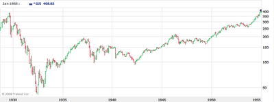
DOW went from 400 to 50 that is a 7/8th reduction which in our case would mean DOW 1750. I just don't buy it. While the reason for our problems are the same, namely over lever, the remedies are much better today.
A recession can be entrenched however. It could go on for a LONG time. See how the DOW regained previous peak 25 years later. Today, it may mean 10 years? DOW 15000 in 2020?
The following time line is 95-08

Next you can clearly see the two bubbles in these shapes. Notice how the curve is very smooth up to 95 and then volatility kicks in at the dotcom boom: too much liquidity, too much money moving too fast, a sign of speculation? too much liquidity? computers? jittery coked-up investors?
95-00 the dot com bubble. 01-08 the housing bubble. If you mentally erase the bubbles, and project the line from 90-95 which was very STABLE, you get DOW 8000. If you assume overshooting on the way down, which is very likely, we may be staring at DOW 6000.
WERE WE JUST LOOKING AT MONETARY INFLATION OF ASSET PRICES THE WHOLE TIME, and nothing more? what a depressing thought. Coming from the IT industry, I believe that productivity gains were real since the mid 90's, so let's give them a round of applause and extra 10%, which gives us a stable position at 9000. Overshoot 6, stable 9. 8.5 is just the beginning then?
Ouch. Wait for it, wait for it.

Comments
It is also interesting to look at 10 year spans using the log scale.
68-78: extremely volatile
78-88: smooth (except for 87)
88-98: very smooth
98-08: volatile
The point here is that on the log scale you actually cannot really see the bubble as clearly as on linear you also cannot extrapolate the linear which you would expect in case of real growth.
I know log will give you a clear sense of growth by displaying the slope as the growth, remember I have a PhD in theoretical physics :)
Point is, for some reason it is clear on a linear one... and if that is the case, does it mean we are staring at little real GROWTH?
That is the scary thought...
Again, was most growth just monetary inflation of assets? Was it fake?
point taken on reading the volatility from linear. It distorted the 95 timeframe, but the 2 bubbles still show as volatile on log, more so on linear of course.